
Adapting Google Material 3 Design system for a Canadian non-profit
Wilber.ai ↴
Wilber — Canada-based non-profit addressing human trafficking and porn addiction through education and conversation.
Role - UX Design, Design System
Team - Julia Lauren Rivera, Brian Rae, Christopher Ballcells
Visit Wilber.ai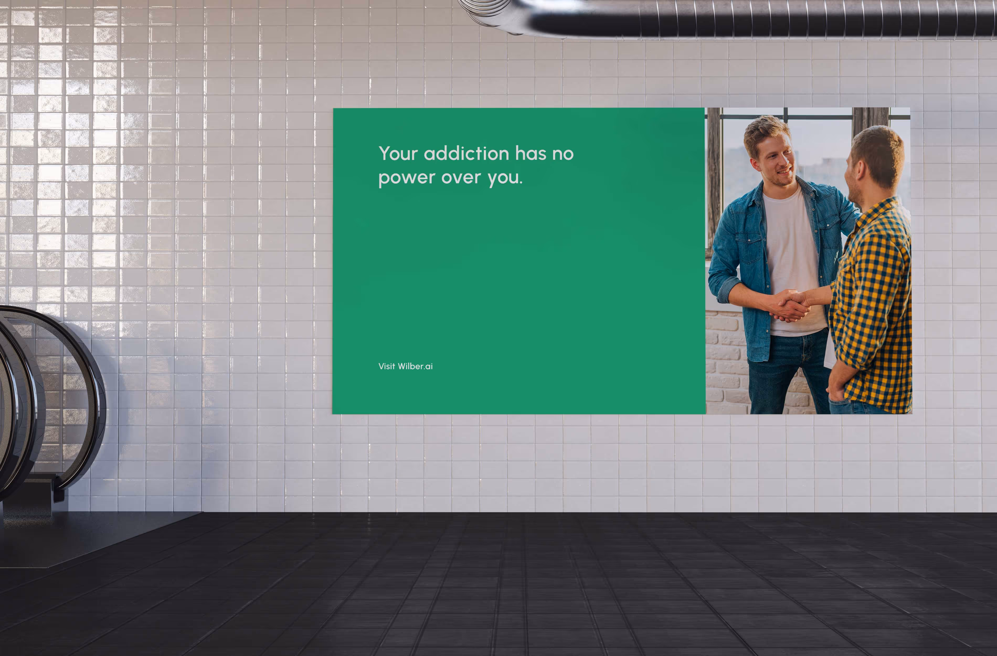
The Challenge
Wilber operates in a highly sensitive problem space. The product needed to feel:
-
Calm and trustworthy
-
Non-judgmental
-
Clear in text-heavy, conversation-driven flows
At the same time, the system had to scale as the product and team evolved. The challenge wasn’t creating a new UI from scratch — it was adapting an opinionated design system (Material 3) without breaking its logic, while introducing a distinct and appropriate brand identity.
The Approach
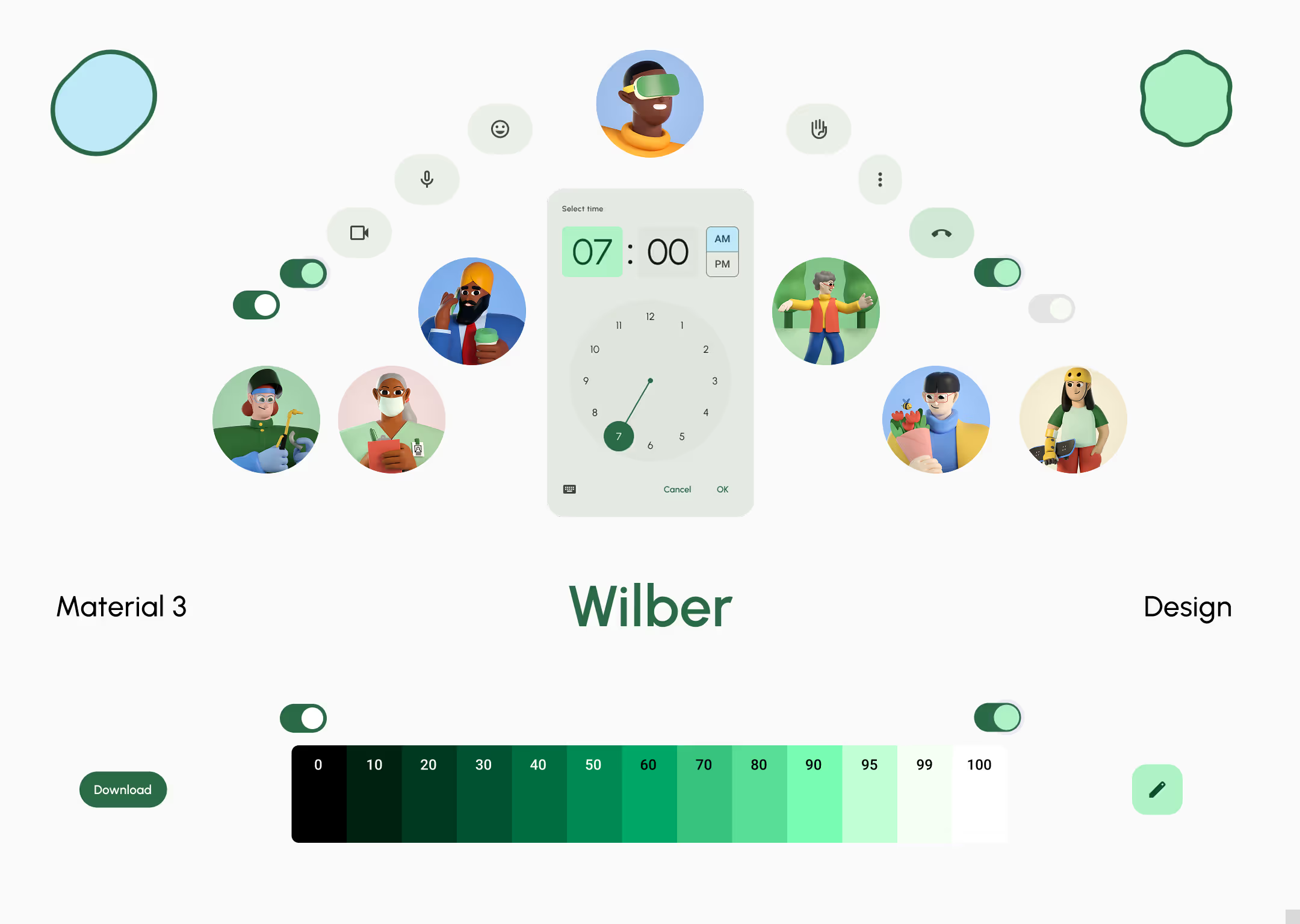
(System-First Thinking) Material 3 was selected for its research-backed components, accessibility, and scalability. The work focused on customization, not reinvention — respecting the system’s principles while aligning it with Wilber’s mission.
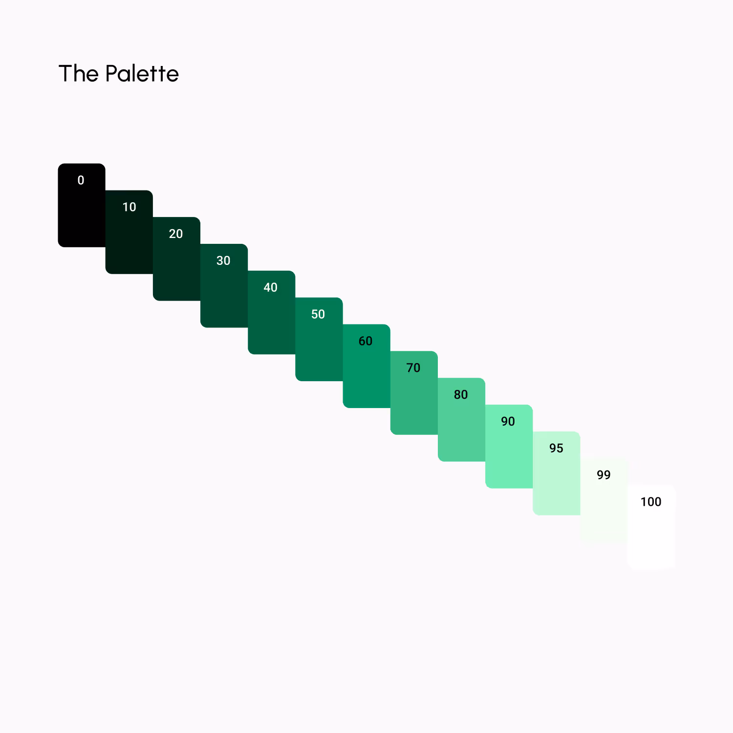
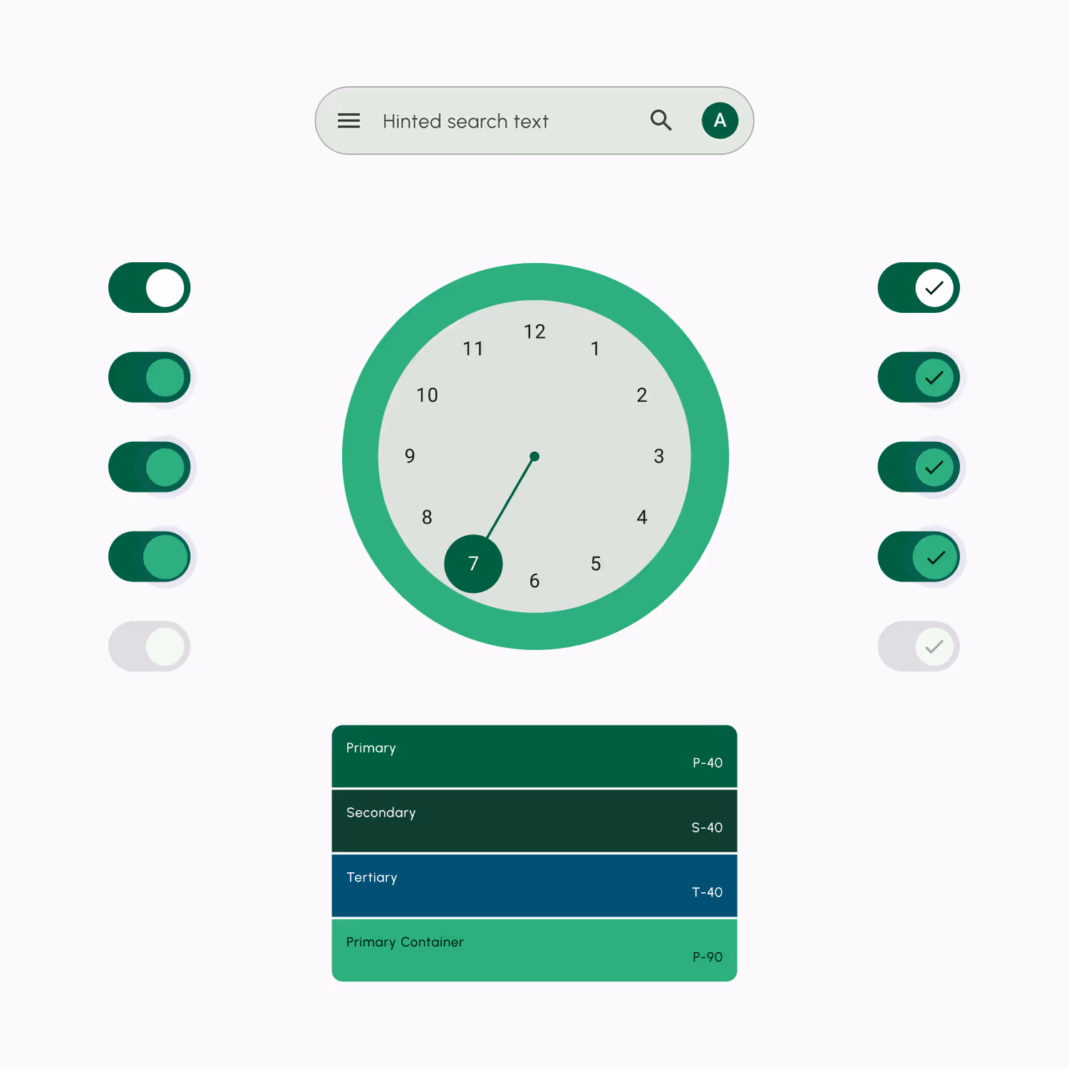
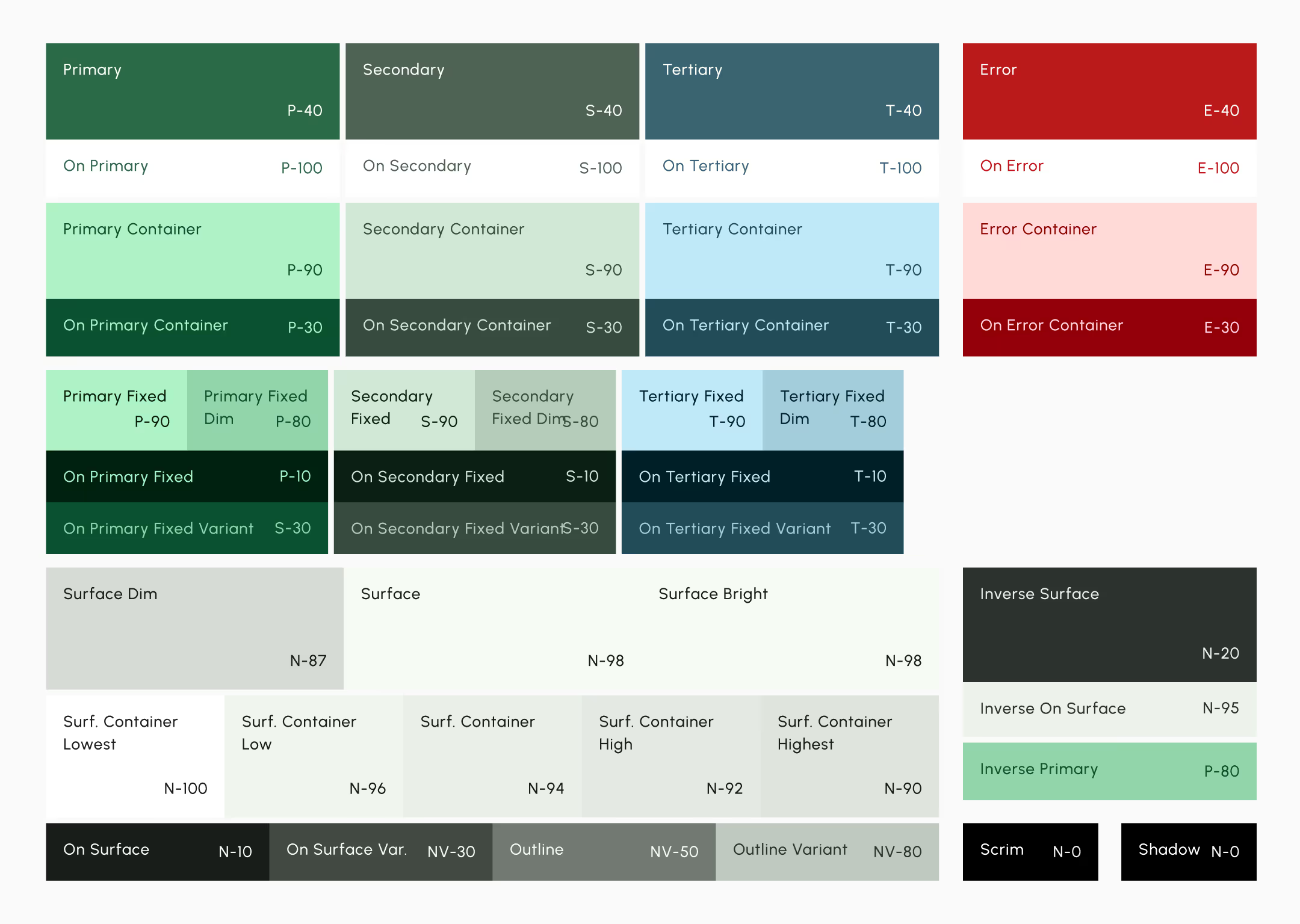
Strategic Colors
For a sensitive domain, color carried emotional weight. I researched and selected a color direction that aligned with Wilber’s core values — calm, safety, and reassurance — and implemented it consistently across the system’s semantic color roles.
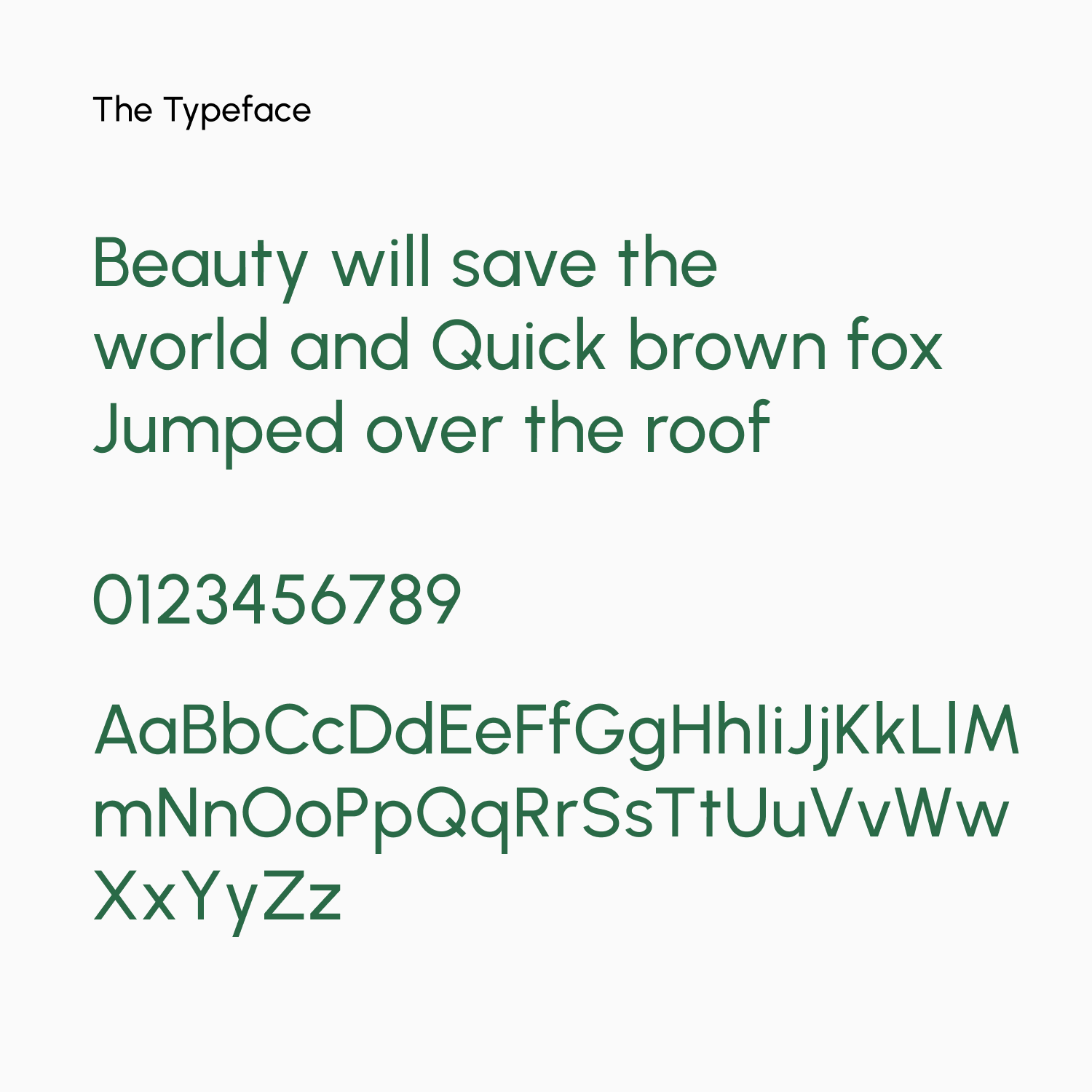
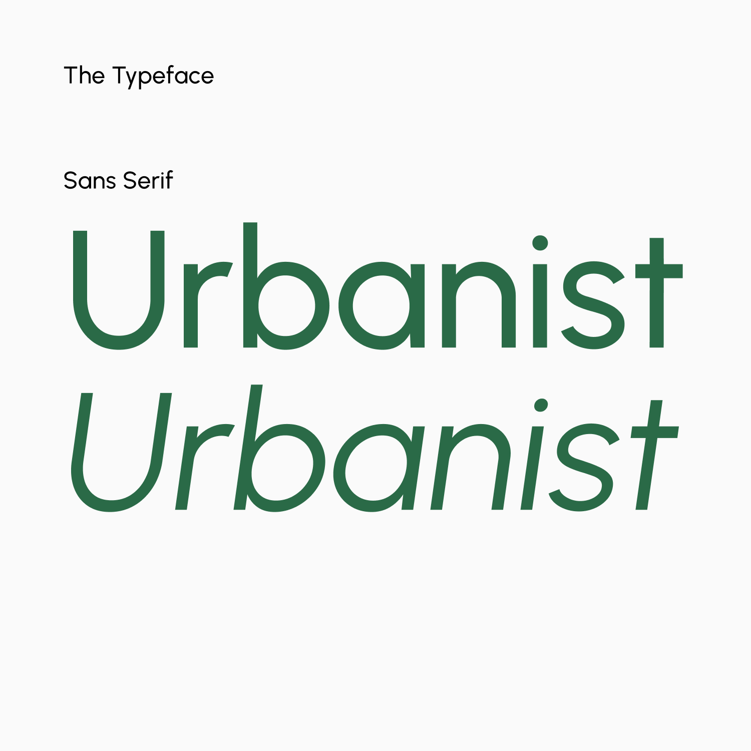
The Typeface ↴
Front and center piece of user experience. Urbanist does it best with clean, modern, provides ease of reading. Urbanist does it like no other typeface.
-
Clean, modern structure
-
Superior readability in long-form and dense UI
-
Wide range of font weights for stronger hierarchy control
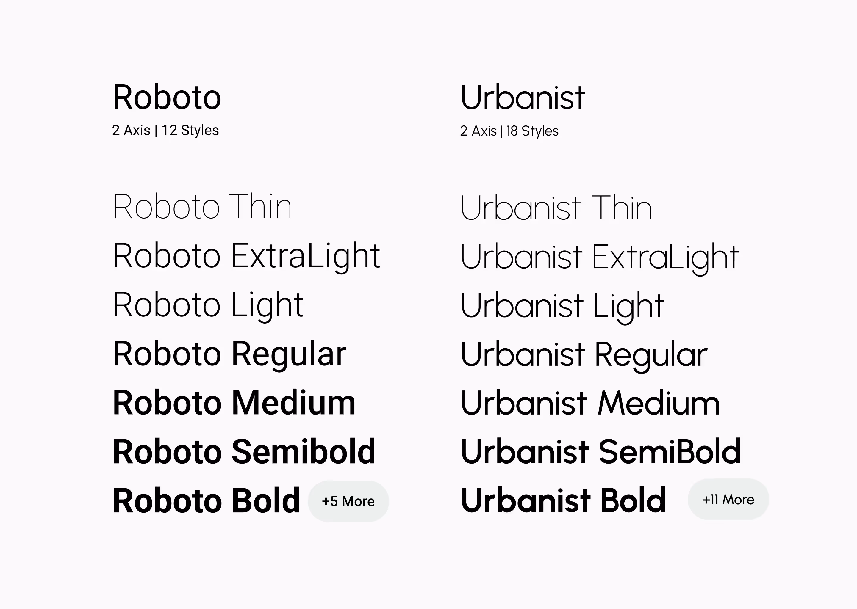
Default vs Custom ↴
Switching from Roboto to Urbanist offer differentiating factor the that brand and elevate the entire experience from vanilla, default setting of design system
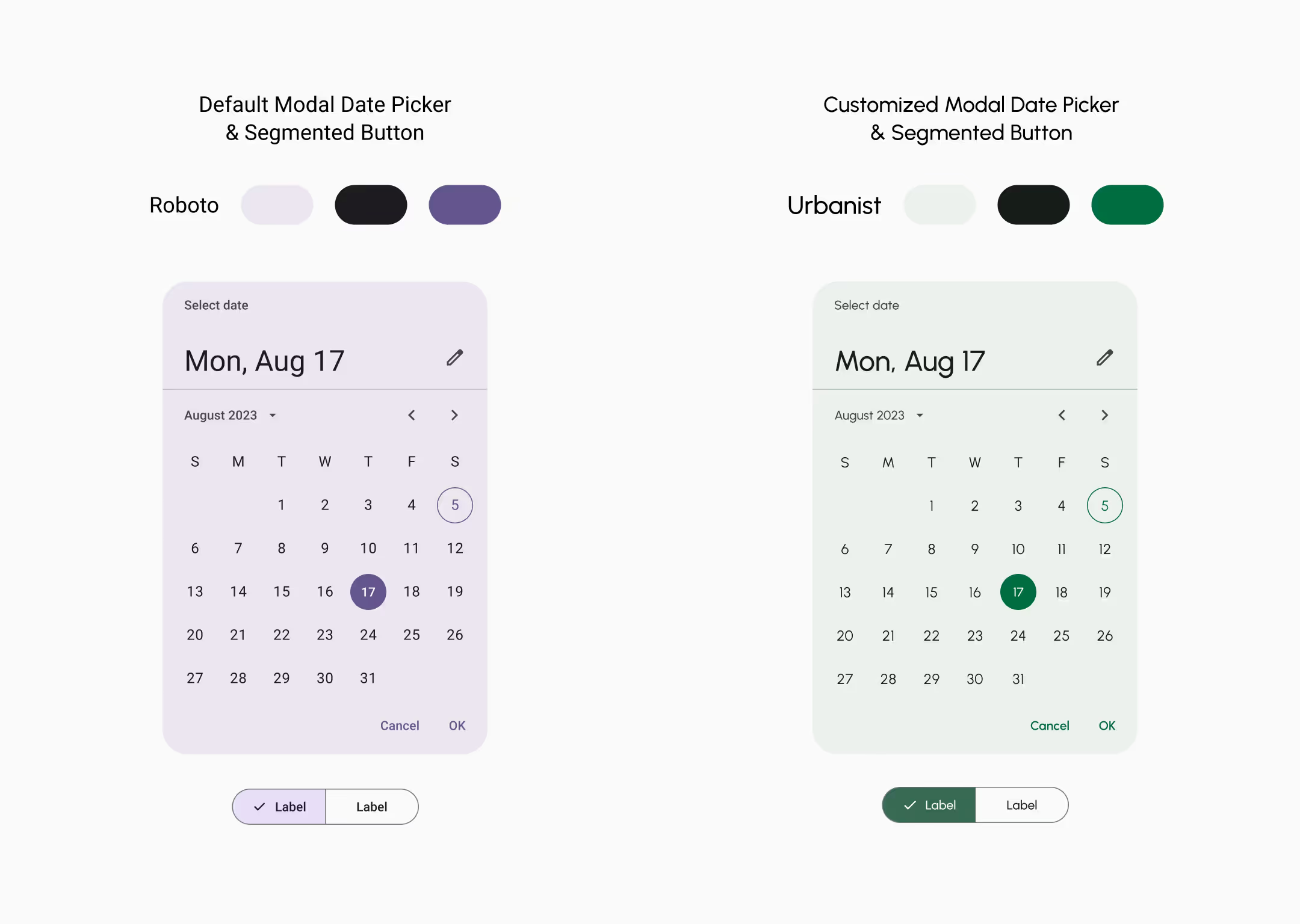
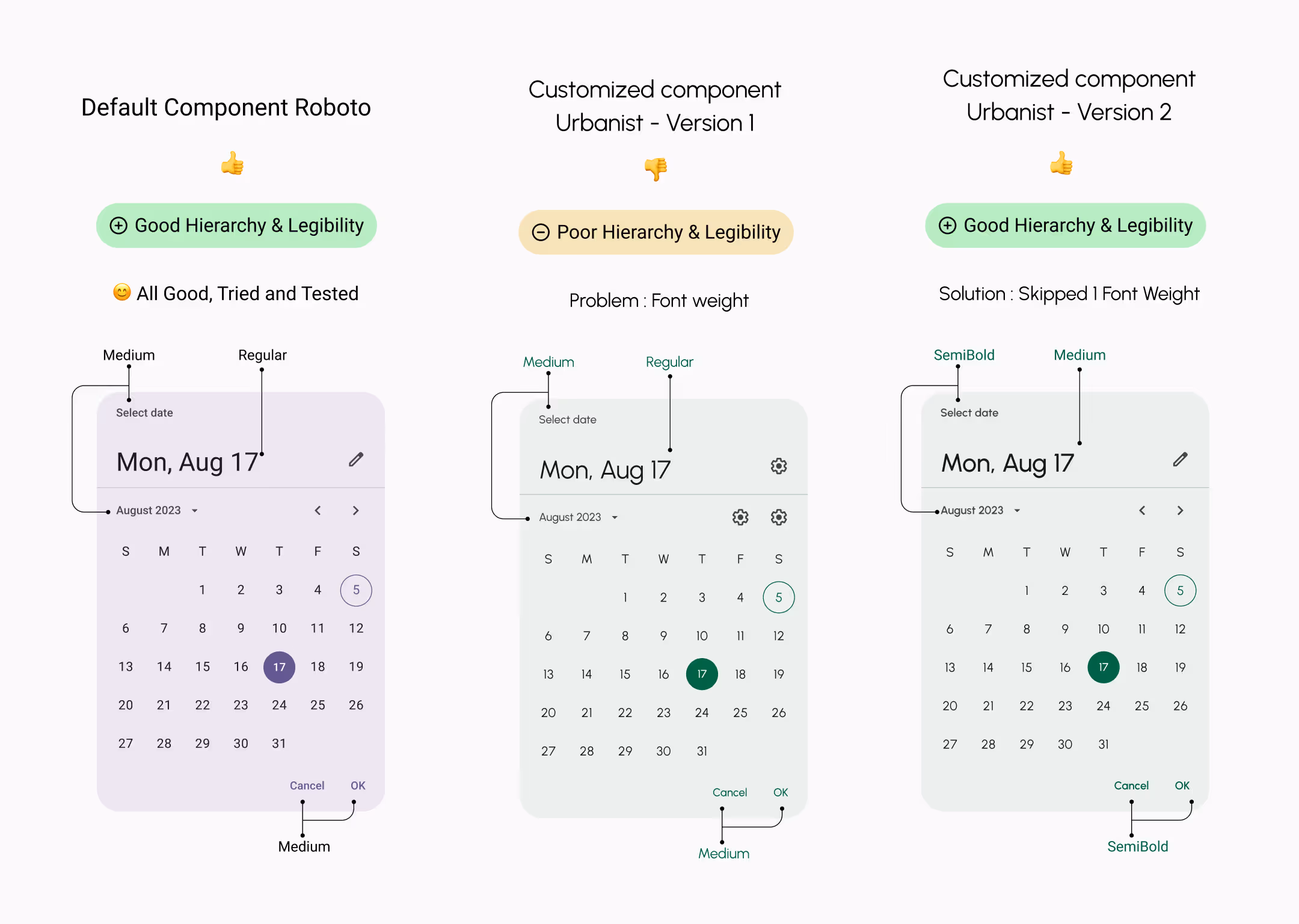
Testing & Tweaking ↴
Preserving Hierarchy in a Custom System
Urbanist’s broader weight range allowed finer control over hierarchy. However, matching Material 3’s original typographic intent required careful adjustments — skipping certain weights to preserve balance across dense components.
Solid Typeface Choice ↴
In this comparison, Urbanist offer more versatility, with multiple fonts weights. Giving more control over typography experience
The Outcome
-
A customized Material 3 system that retained structural integrity
-
Improved readability and hierarchy in text-heavy interfaces
-
A clear, calm visual language appropriate for a sensitive mission
-
A scalable design foundation ready for product growth
Wilber.ai ↴
Wilber is a Canada Based non-profit fighting against the problem of Human-trafficking and Educating people about porn addiction
Visit Wilber.aiTestimonial
I highly recommend Anmol for his outstanding work as a UI/UX Designer with our team. He excels at creating intuitive wireframes and customizing the Google Material 3 design system, ensuring a seamless and visually consistent user experience. His collaboration with cross-functional teams has significantly improved user flows and usability. Anmol’s dedication and expertise have been invaluable to our project
Brain Rae | Founder Wilber.ai